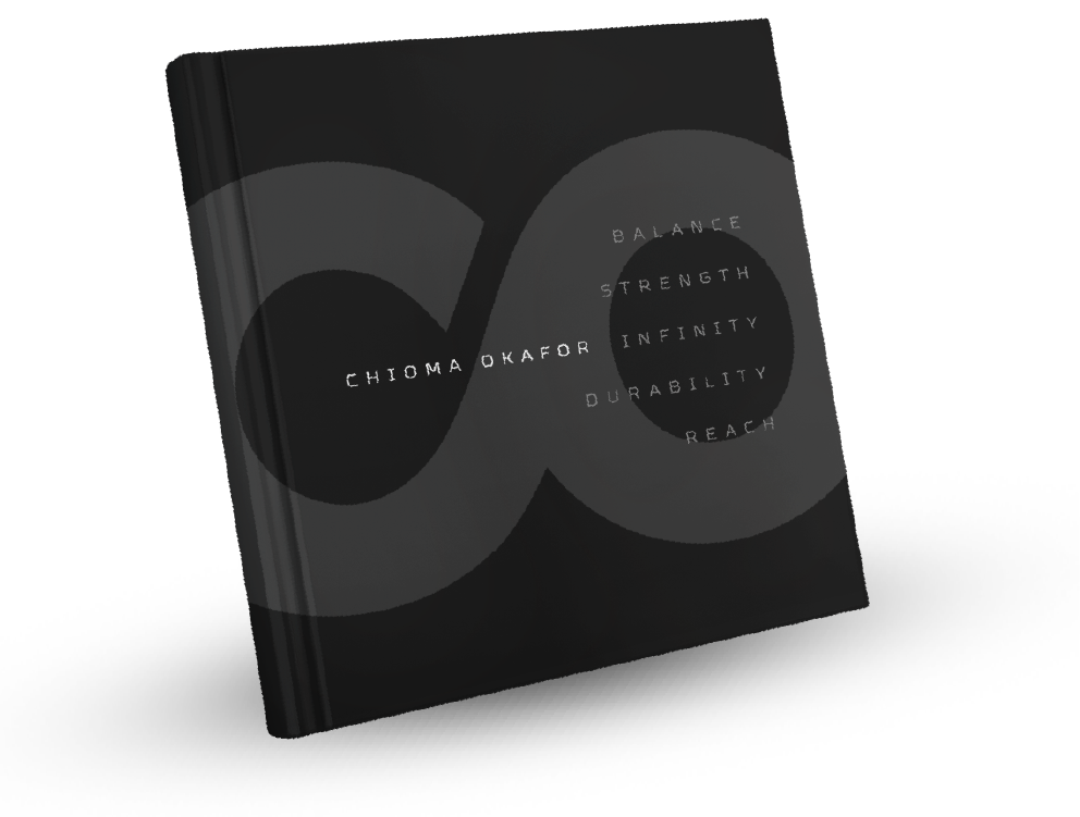
BALANCE / STRENGTH / INFINITE DURABILITY / REACH
This logo merges the letters “C” and “O” into a bold, unified mark that represents connection, momentum, infinity loop, and global presence. The open curve of the “C” flowing into the complete “O” symbolizes ambition evolving into achievement, reflecting a soccer player whose style is fluid yet powerful. The structure conveys movement with direction, suggesting an athlete who not only creates opportunities but strategically connects play, teammates, and vision into one cohesive force.
The circular “O” reinforces strength, balance, and mastery, while subtly mimicking both a soccer ball and the globe. This dual symbolism positions the player at the center of the game and on the world stage. Together, the forms communicate durability, international reach, and brand influence — presenting Chioma, the soccer player as a globally connected professional whose impact extends beyond the pitch.